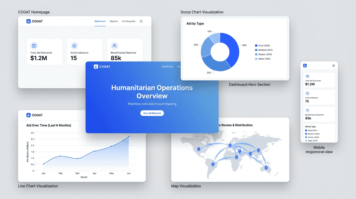
COGAT Aid Portal
Redesigning humanitarian data transparency under diplomatic pressure.
“COGAT was publishing accurate real-time humanitarian aid data. The interface made it look like the data was hiding something.”
COGAT coordinates civilian policy and humanitarian logistics in the territories. During a period of intense international scrutiny, their portal was publishing accurate numbers through an interface that undermined them - raw backend tables, no clear hierarchy, visual language that read as political rather than authoritative. The brief was tight: one week, one designer, legacy technical constraints. The goal was not to change the data. It was to make the data credible.
How the week unfolded.
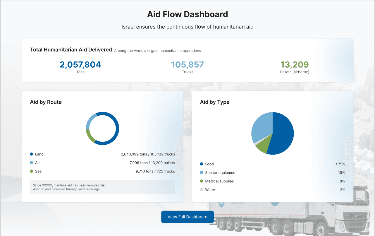
Auditing the existing portal
The legacy site had two layered problems. The navigation was organized around Israel's internal administrative categories - not around what a journalist or diplomat comes to verify. And the data itself was presented in raw backend format: tables without hierarchy, charts without annotation, no clear entry point. Before drawing a single wireframe, I mapped the gap between what the portal was publishing and what primary users needed to locate in under 60 seconds.
The brief assumed a visual problem - the interface looked untrustworthy, so make it look trustworthy. The audit said otherwise: the hierarchy was organized around administrative categories meaningful inside the Israeli government and invisible to a journalist verifying numbers on deadline. A visual fix on top of that structure would have shipped a cleaner version of the same problem. Restructuring instead of reskinning spent days I did not have in a one-week engagement, and it is the reason the result held.
Choosing the right direction
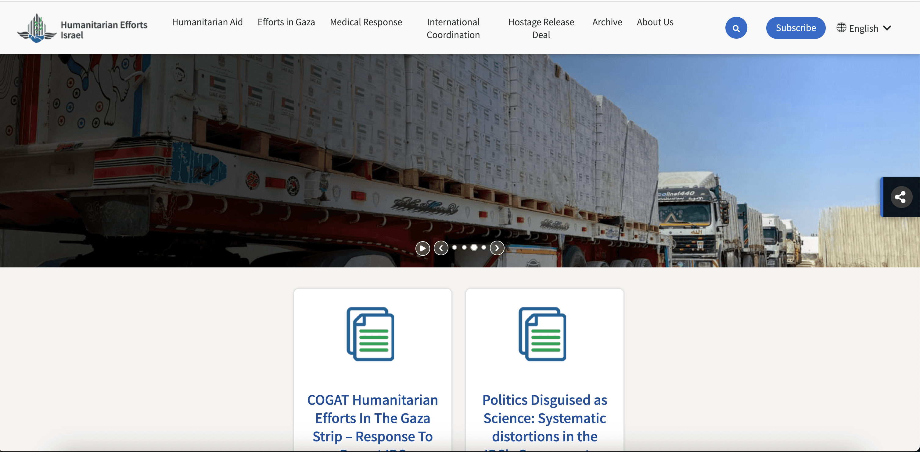
Two concepts went into review. Concept A led with imagery and narrative - humanitarian photography, emotional framing, data as supporting evidence. Concept B led with the data itself - KPIs front and center, neutral palette, no political visual language.
Concept A tested better emotionally and was the more impressive piece of design. I argued against it. For a journalist or a diplomat, storytelling-first reads as spin, and a portal accused of hiding something cannot afford to look persuasive. Concept B was harder to make good and gave up every tool that makes a page feel designed - photography, narrative, warmth. Trust through transparency, not persuasion. On this brief that was the only defensible call, and it meant shipping the less beautiful option.
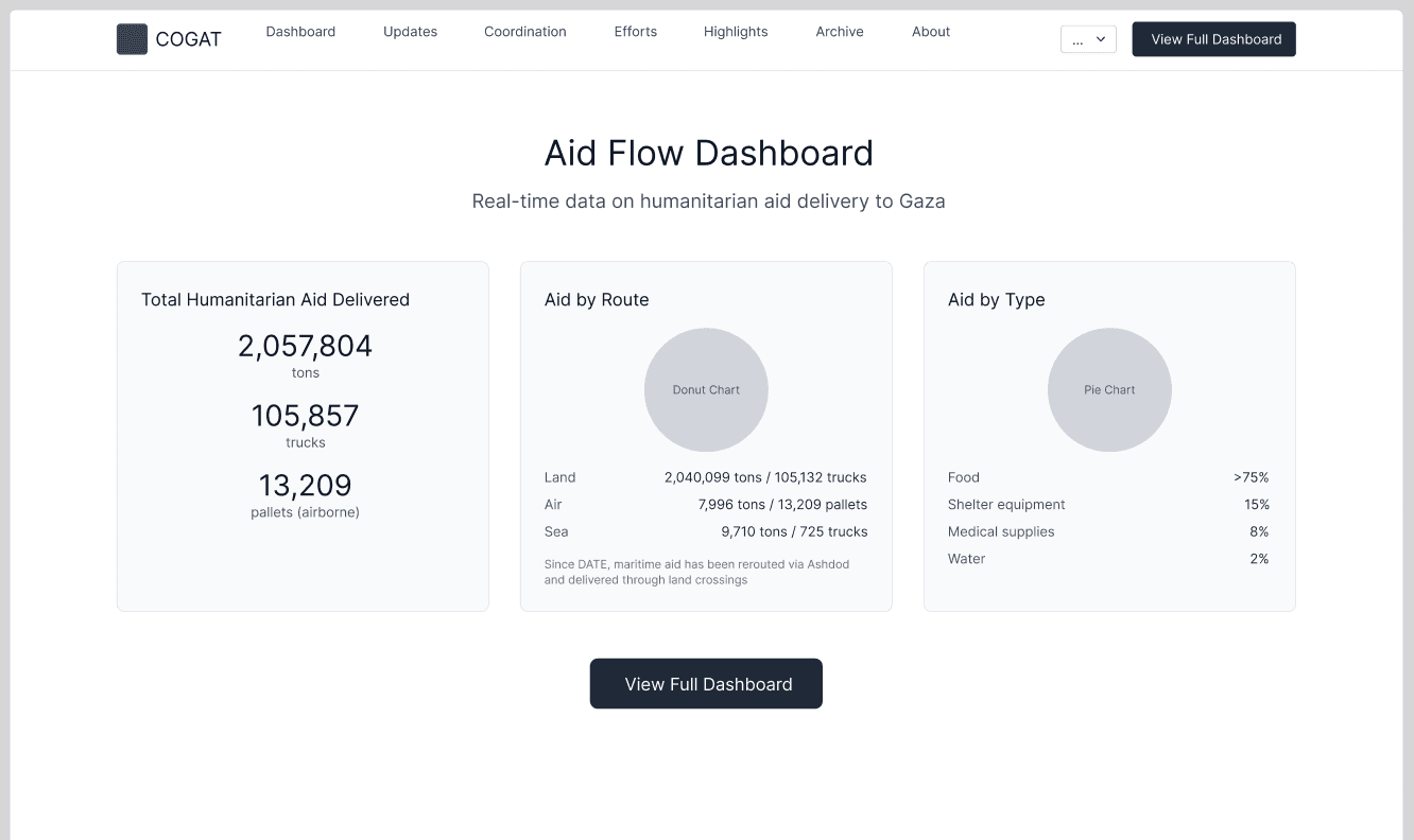
Selected direction: data-first, neutral, structured for verification
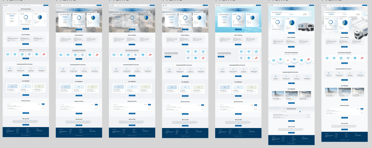
Seven layout iterations before locking the final structure
AI-accelerated design loop
A one-week timeline covering homepage, analytics dashboard, and design system is not a reasonable scope without leverage. DesignIntel handled competitive analysis of comparable humanitarian portals and synthesized structural patterns. UX Pilot generated wireframe skeletons that I evaluated and redirected within minutes. Figma was the single source for all high-fidelity output. The AI tools didn't make design decisions - they compressed the distance between a direction and a testable artifact. Every fork in the road was a human judgment call. DesignIntel generated both concept directions. Both were defensible at the principle level - the project team's decision wasn't about which one was right and which was wrong, but about which one held up under diplomatic scrutiny. That distinction - between aesthetically valid and diplomatically defensible - was the judgment call the tool couldn't make.
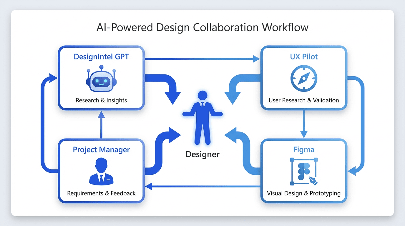
Hybrid workflow: AI for speed, designer for judgment
What we shipped.
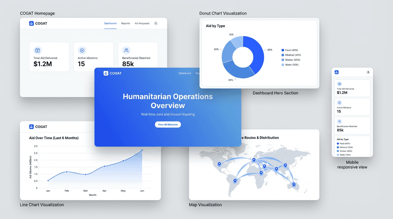
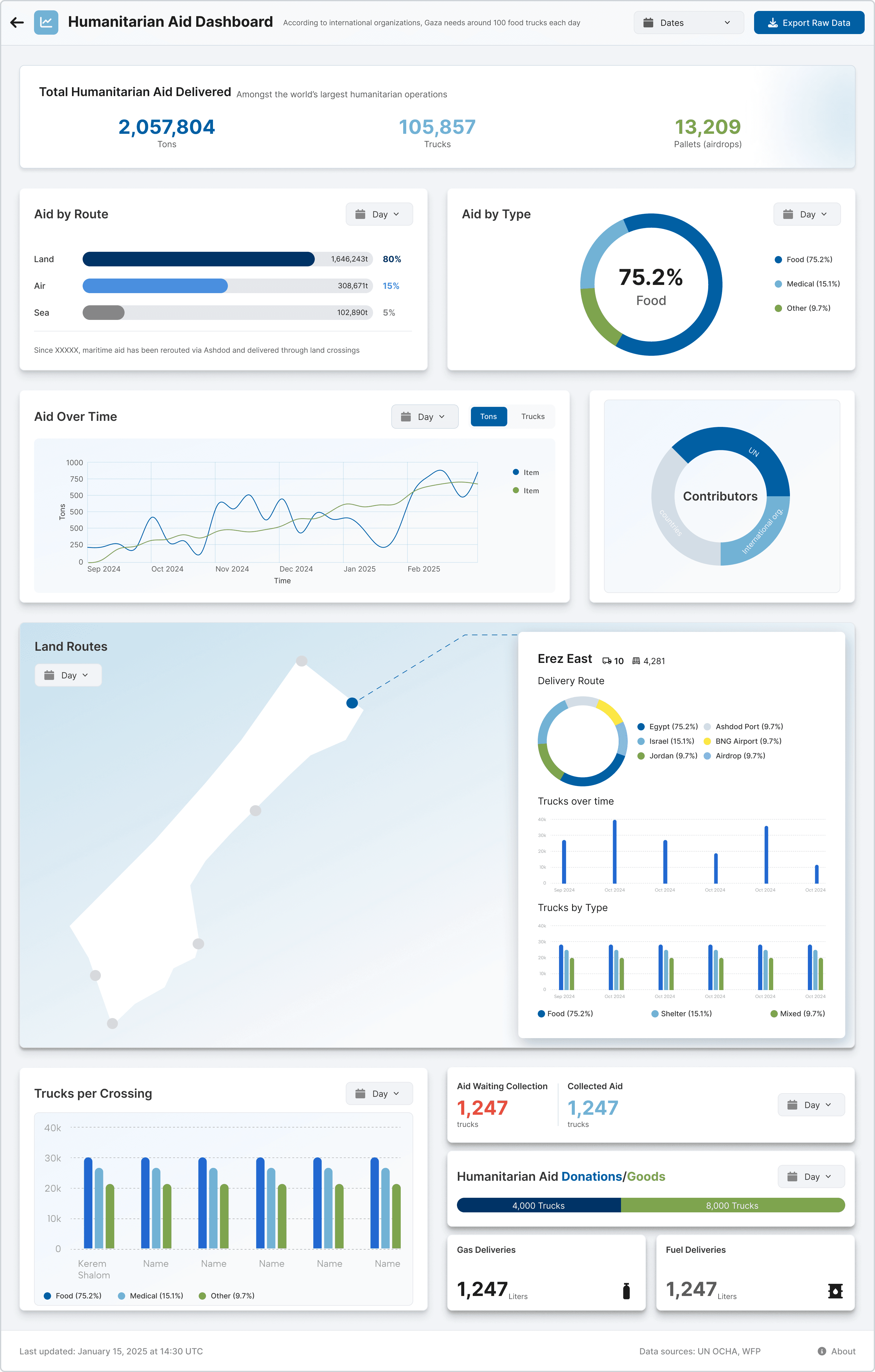
Homepage and full analytics dashboard. Institutional without being political. Built to be read by journalists and diplomats on deadline.
What it changed.
At kickoff, the development team walked me through the legacy infrastructure constraints - what the system could and couldn't support. I listened, then set the list aside. Designing within known limits from day one shapes every decision before you've had a chance to define the right one. When I presented the finals, the project manager told the dev team they would build it as designed. They found a way. The harder constraint, it turned out, was diplomatic - every color, annotation, and chart label had to read as neutral to audiences with opposing priors. That pressure produced a cleaner outcome than an unconstrained brief would have.
Radar Shield
Electronic Warfare for the Royal Navy