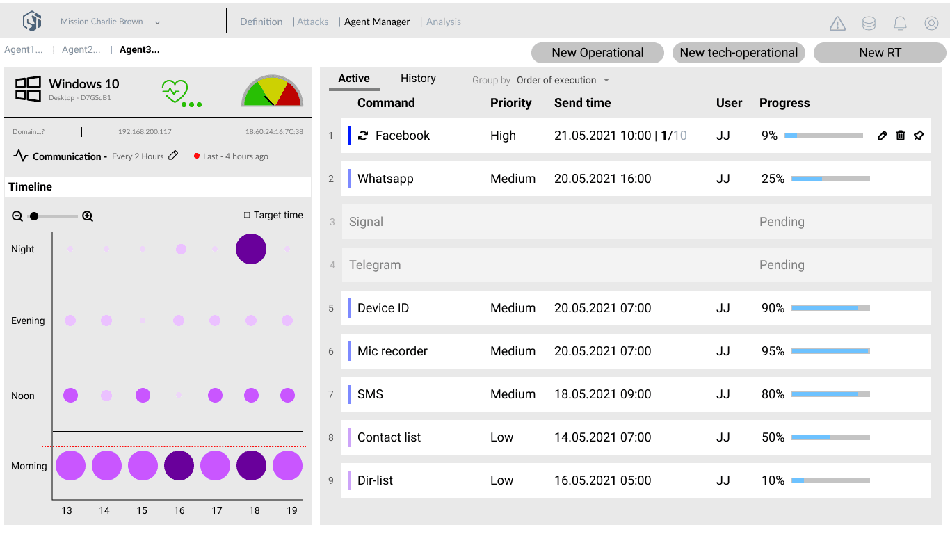
“The system could place agents on a target's device, extract communications, location data, and device identifiers, and self-destruct on detection - all running simultaneously across multiple targets. Operators were managing every agent, every command, and every status check through a command line. By hand.”
Cytotech builds offensive cyber platforms for classified defense clients. The system runs intelligence operations: software agents are covertly deployed onto target devices, where they extract data - emails, contacts, location history, communications from encrypted apps - and report back while staying invisible on the target. A single operation runs multiple agents in parallel, each executing a separate command queue, each at a different stage of extraction. The operator's job is to manage all of it live: which agents are healthy, what commands are queued, what intelligence has come back, and whether any agent needs to be terminated before it is detected. I designed the full UX for the control interface. Because of classification restrictions, I had no direct access to operators at any point in the project - every insight came through the product team and subject matter experts. The concept was presented to the full company at the end with no user testing behind it. Two minor comments came back. No substantive opposition.
How the system came together.
The constraint that sharpened the process
Standard user research was off the table. Classification restrictions removed direct operator access entirely. Every requirement came filtered through the product team and SME sessions. I used those sessions to map the shape of the operator's day: which decisions competed for the same attention, which states were dangerous, which tasks were routine versus critical. Cross-referencing session notes against the system documentation gave me a user model specific enough to design from - even without a user in the room.
I asked to get into a room with one operator under any clearance arrangement available. The answer was no. So I designed from the documentation, and the product team called the result "technically correct but operationally wrong" - a fair verdict and an expensive one. The method that replaced it treats SME sessions as the primary source and documentation as the cross-check, never the reverse. It is slower and it is inference, not observation. I would not defend it on a project where real user access was possible.
Two areas, one screen
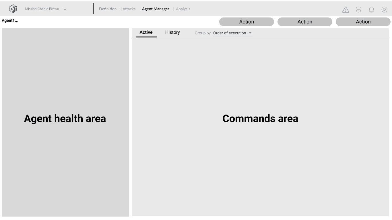
The core structural decision came before designing a single element. An operator managing live agents runs two cognitive tasks simultaneously: monitoring what each agent is doing and deciding what to tell it to do next. Health monitoring and command dispatch cannot compete for the same visual space. I split the screen into two fixed zones - agent health on the left, command queue on the right - and got that structure confirmed by the product team before elaborating anything inside it. Every screen that followed inherited the same spatial logic.
The first concept was tabbed - one tab for monitoring, one for commands. It is the obvious answer and it buys a lot of room. A walkthrough killed it: switching tabs during a live operation means losing sight of an agent at the moment it is most likely to be detected. Splitting the screen permanently means neither task ever gets the full canvas, and every screen in the system inherits that compromise. I took the constraint, because both tasks had to be visible at once and never behind a click.
From raw extractions to readable intelligence
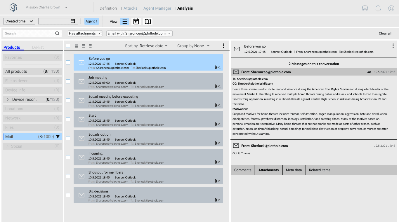
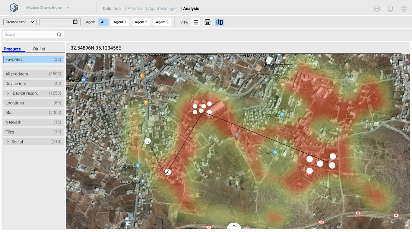
The analysis view is where retrieved data becomes usable. Agents extract emails, files, contacts, and device records from the target. The operator needs to browse, filter, and read that material quickly. The design challenge was not building a data viewer - it was finding a mental model operators already had. A three-column layout maps directly onto an email client: categories on the left, item list in the centre, detail panel on the right. An operator already knows how to work it without any training. The initial design was a custom data grid - sortable columns, bulk export, filters. In review, the product team pointed out that operators weren't analysts - they needed to browse and read, not process. The email-client metaphor borrowed a mental model operators already had without training.
A prototype that replaced fieldwork
Because direct user testing was blocked, the animated Figma prototype had to carry the full weight of what field research would normally provide. I built it around a developing scenario rather than a sanitised demo: from first surveillance contact through to target incrimination, including what happens during extended time on target. Walking through the scenario end-to-end surfaced capabilities that weren't in the initial requirements. I brought those to the product team not as questions but as proposals - features worth building that the brief hadn't asked for. Several made it into the accepted scope. The company ran a full internal review through the scenario. The concept came back with two or three minor comments and no substantive opposition. Accepted on first presentation.
What we shipped.
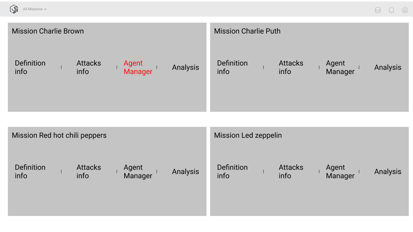
Five views covering the full operational cycle: the All Missions dashboard for situational overview; Definition, Attacks, and Agent Manager for running a mission live; and Analysis for processing what came back. Agent Manager is the core - health status, activity timeline, and command queue side by side on one screen, for one agent at a time.
What it changed.
When classification blocks user access, the prototype becomes fieldwork. Every decision that would normally get tested with a real user had to be stress-tested by making the scenario specific enough for people who knew the real operation to point at what was wrong. The concept came back almost clean. That outcome, with zero direct user access, was the whole point of building the prototype the way I did.
DHL
Making the Paperless Process Easy