“Signal officers planning a multi-unit operation needed to verify radio coverage across dozens of battalion nodes, compare multiple alternatives, and produce a synchronized plan before units deployed. The process ran across spreadsheets and paper maps. Errors did not surface until the mission was already in the field.”
NPMS is an Elbit Systems platform for planning communications across military operations. A mission involves dozens of units - from battalion command posts down to platoon level - each needing frequency assignments, communication links, and coverage verified against terrain. Before the system, that work ran in spreadsheets and paper maps, with no simulation capability and no way to compare alternatives before committing. I designed the full UX from initial concept through a programmed prototype, working with the product manager and operational subject matter experts. The system was built to win a competitive bid - and did. The usability workshop scheduled to validate it was planned for two days. It took two hours.
How the system came together.
Understanding the planning chain
The project started with a full system requirements review from the product manager, followed by sessions with experienced signal officers. Research mapped the planning workflow from first principles: how an officer translated a mission order into a frequency plan, coordinated it across the unit hierarchy, and distributed it before an operation. Two competing demands surfaced early. Planners needed to hold both the organizational structure - who reports to whom, battalion down to platoon - and the terrain arrangement simultaneously. Most tools handled one axis at a time.
The initial concept was grounded in a reference design the client had already approved, which is the safe way to start a competitive bid. It handled the terrain map well and treated unit hierarchy as a lookup panel - secondary, not equal. Signal officers rejected that in the first session: "I plan against both at once." Rebuilding around dual-axis access meant giving up the credibility of a pre-approved starting point and asking the client to accept a structure they had not seen before, on a project that had to win a bid.
Two axes, one workspace
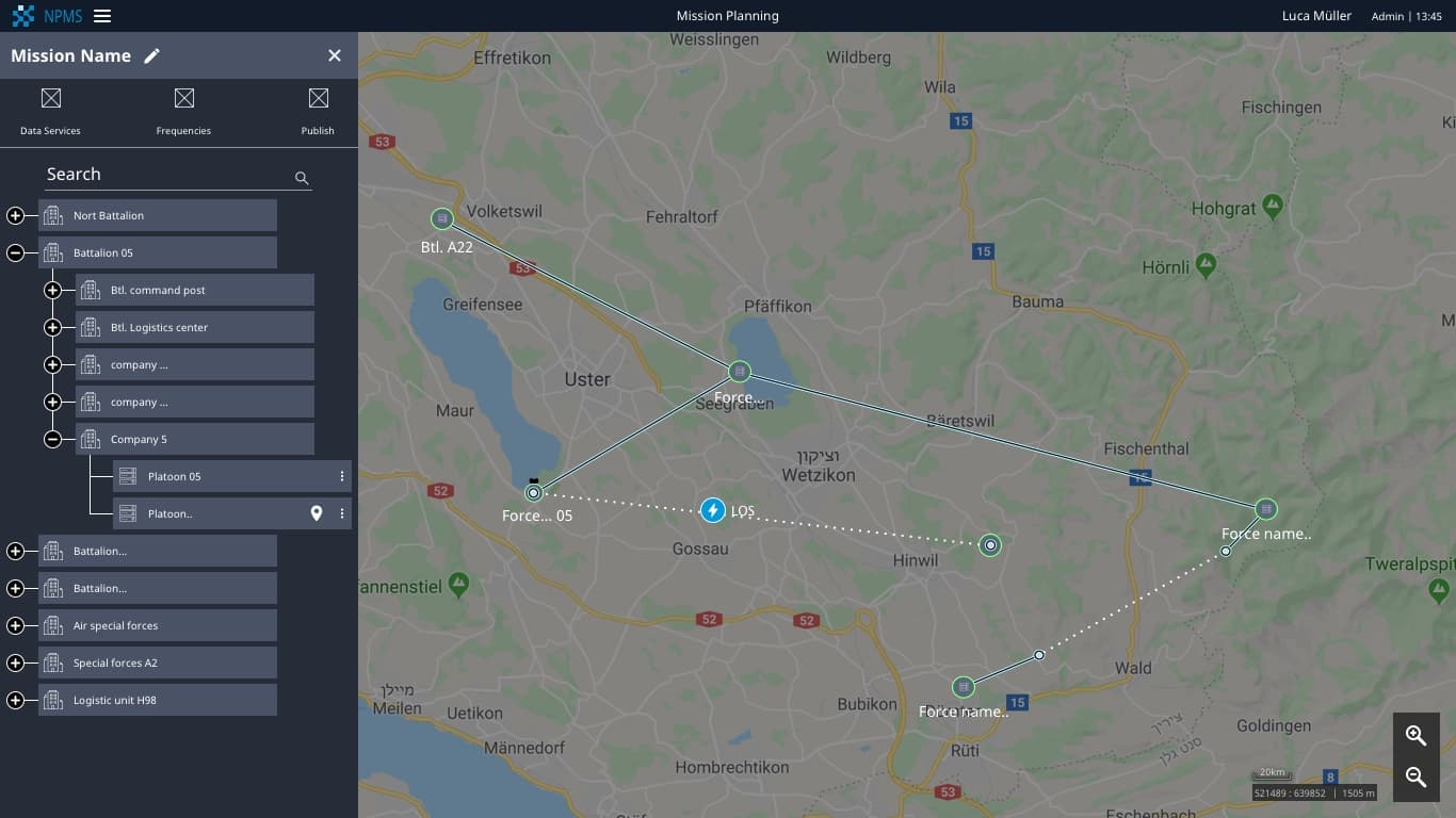
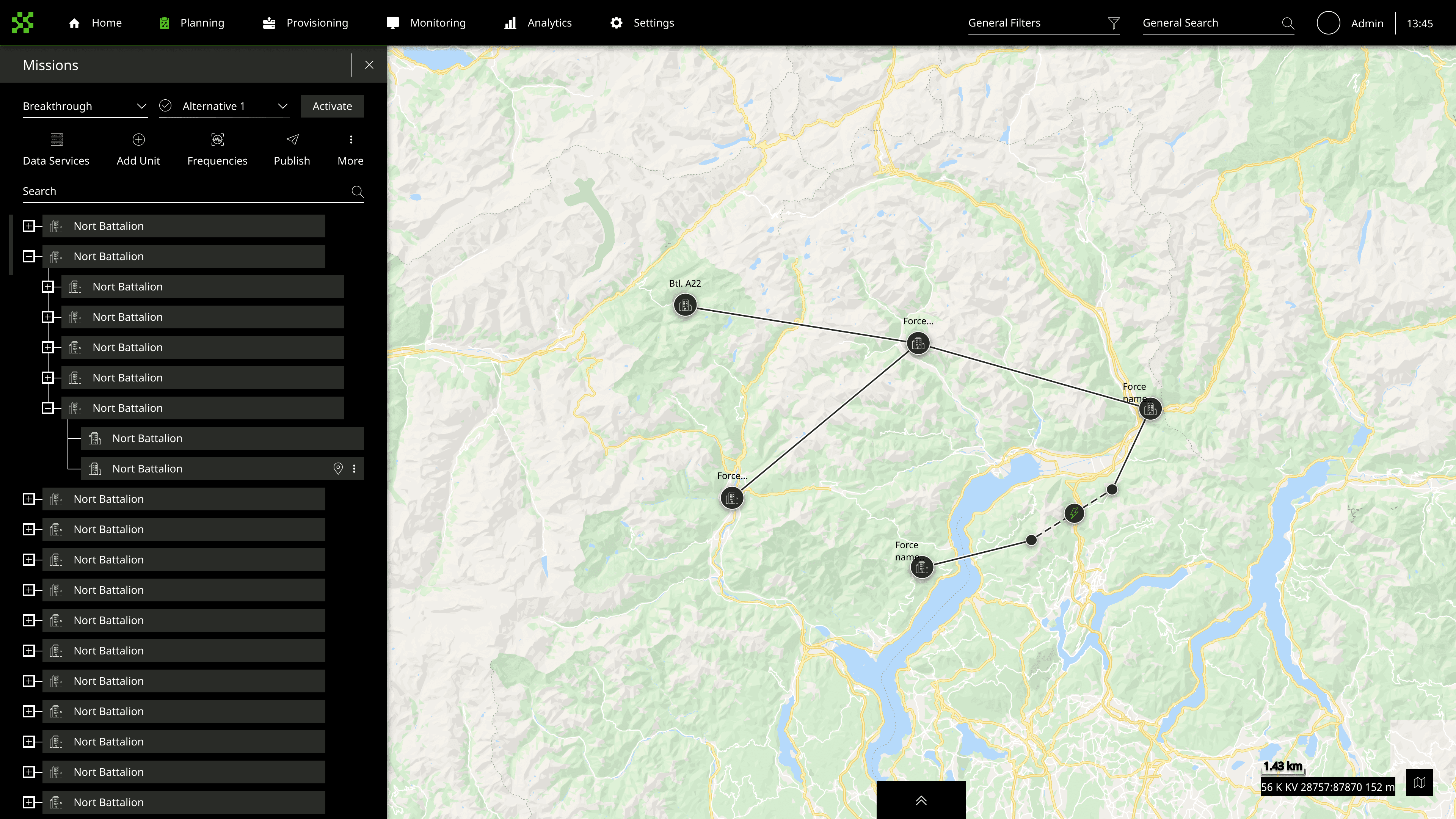
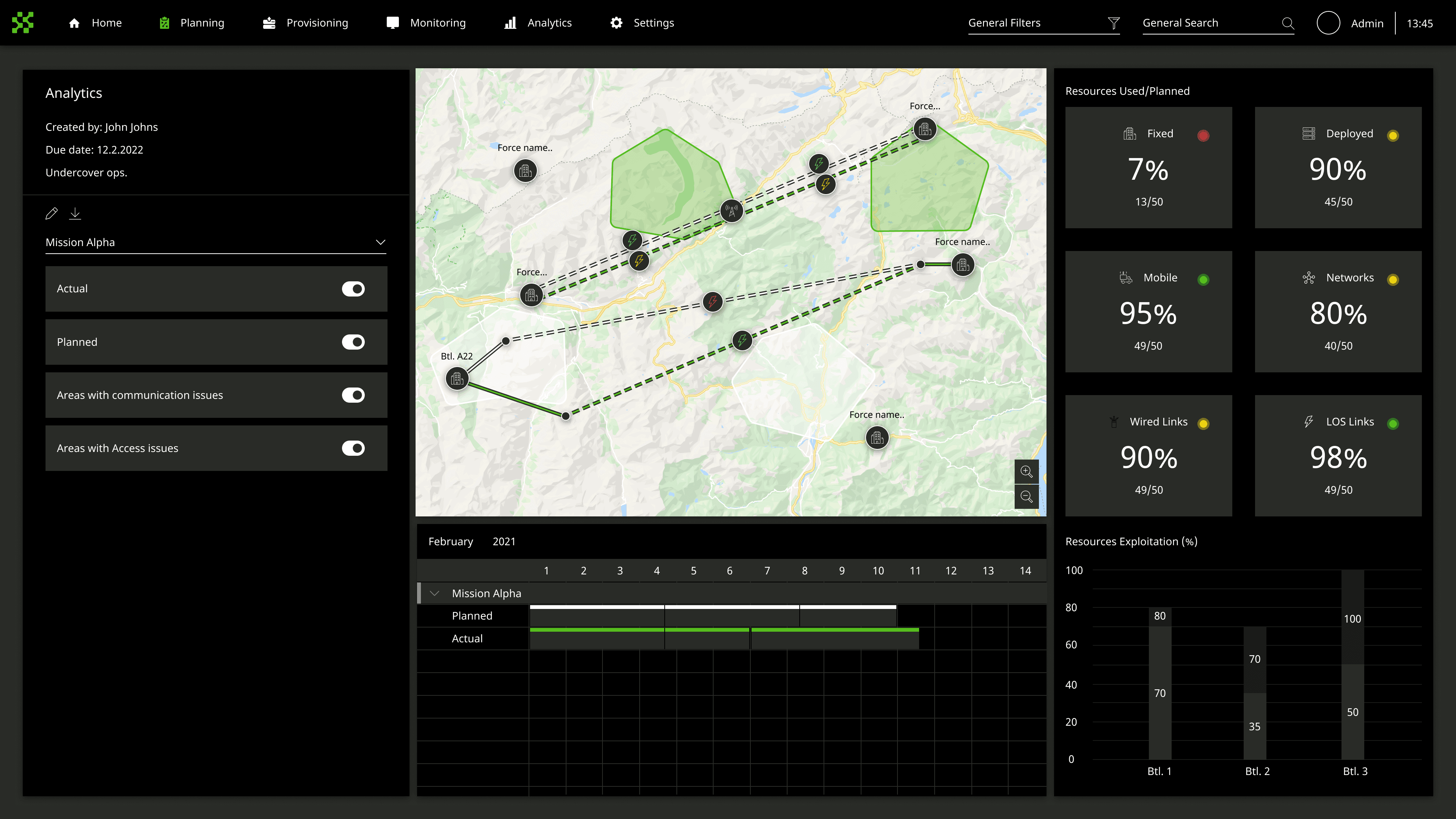
The core structural decision was to give the planner both axes at once: the mission's unit hierarchy as a collapsible tree on the left, the terrain map on the right with units placed as nodes and communication links drawn as routes between them. Planners already thought this way - command structure and terrain position were the two inputs to every planning decision. The left panel collapses and expands from battalion level to platoon and back. A commander sees the full force structure; a platoon leader sees only their nodes. The interface matched the mental model operators already brought to the table. The first attempt integrated both axes onto the map itself - units as nodes on terrain, hierarchy expressed through color and grouping. With 40+ units on the canvas it collapsed into visual noise. Separating the tree panel gave each axis its own reading order.
Comparison as a first-class decision
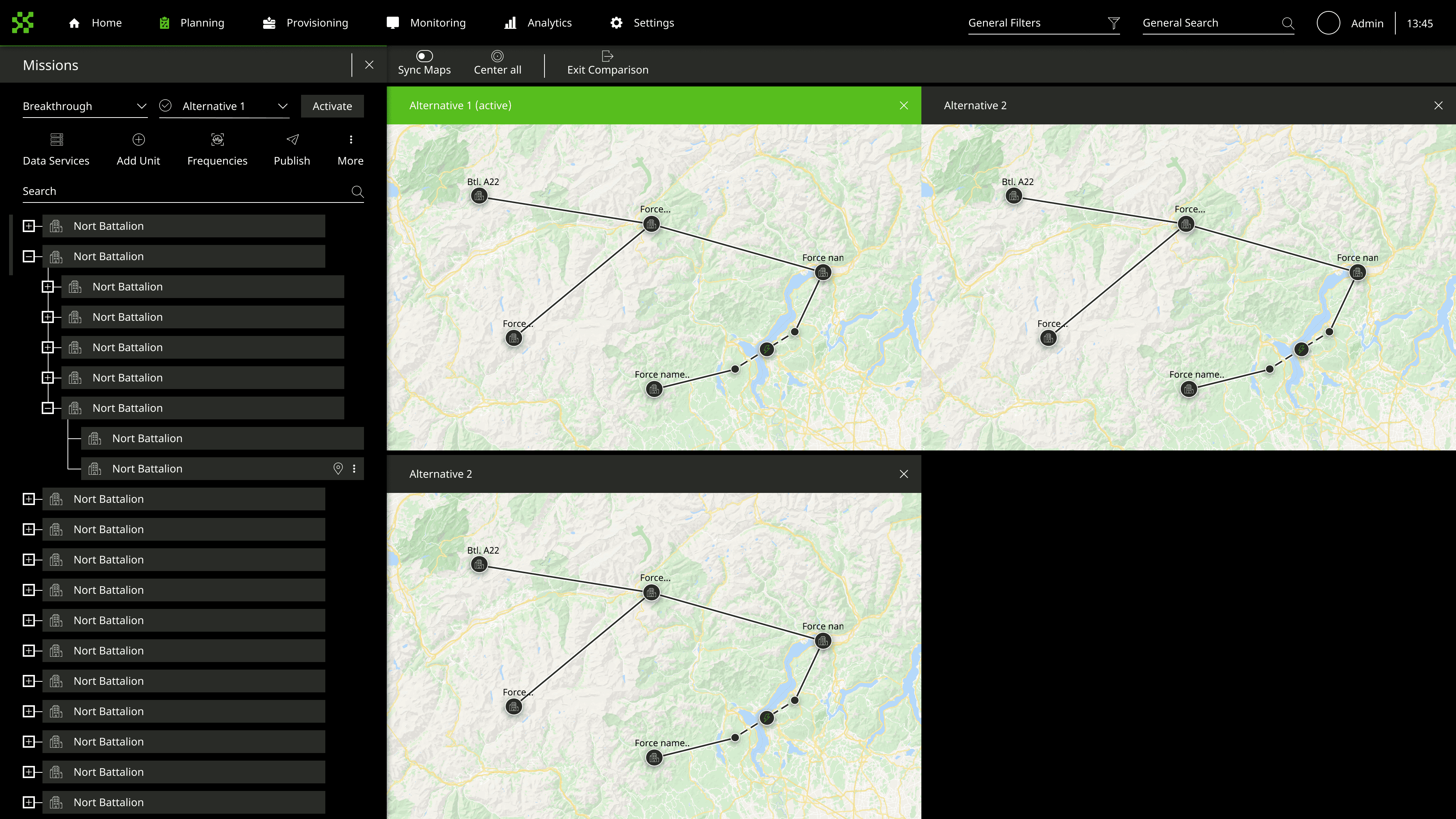
After the UX concept was accepted, the work split into three parallel tracks: UI concept development, UX detail design, and preparation for a programmed prototype for usability testing. The comparison mode - three mission alternatives displayed side by side on the same map canvas - came out of the SME sessions. Commanders never evaluate one option in isolation. They review two or three, pick one, and commit. The system needed to make that review step happen inside the platform, not on paper between screens.
The first version was save-and-compare: build a plan, save it, navigate to a comparison screen. Cheap to build and it fits the data model. SMEs rejected it outright, and the sentence that settled it was "I need to see them next to each other, not remember what the first one looked like." Sequential comparison asks the commander to hold a plan in working memory while evaluating another one - the exact load the system exists to remove. Three plans on one canvas costs a great deal of screen and forced every map component to survive being rendered at a third of its intended size.
What we shipped.
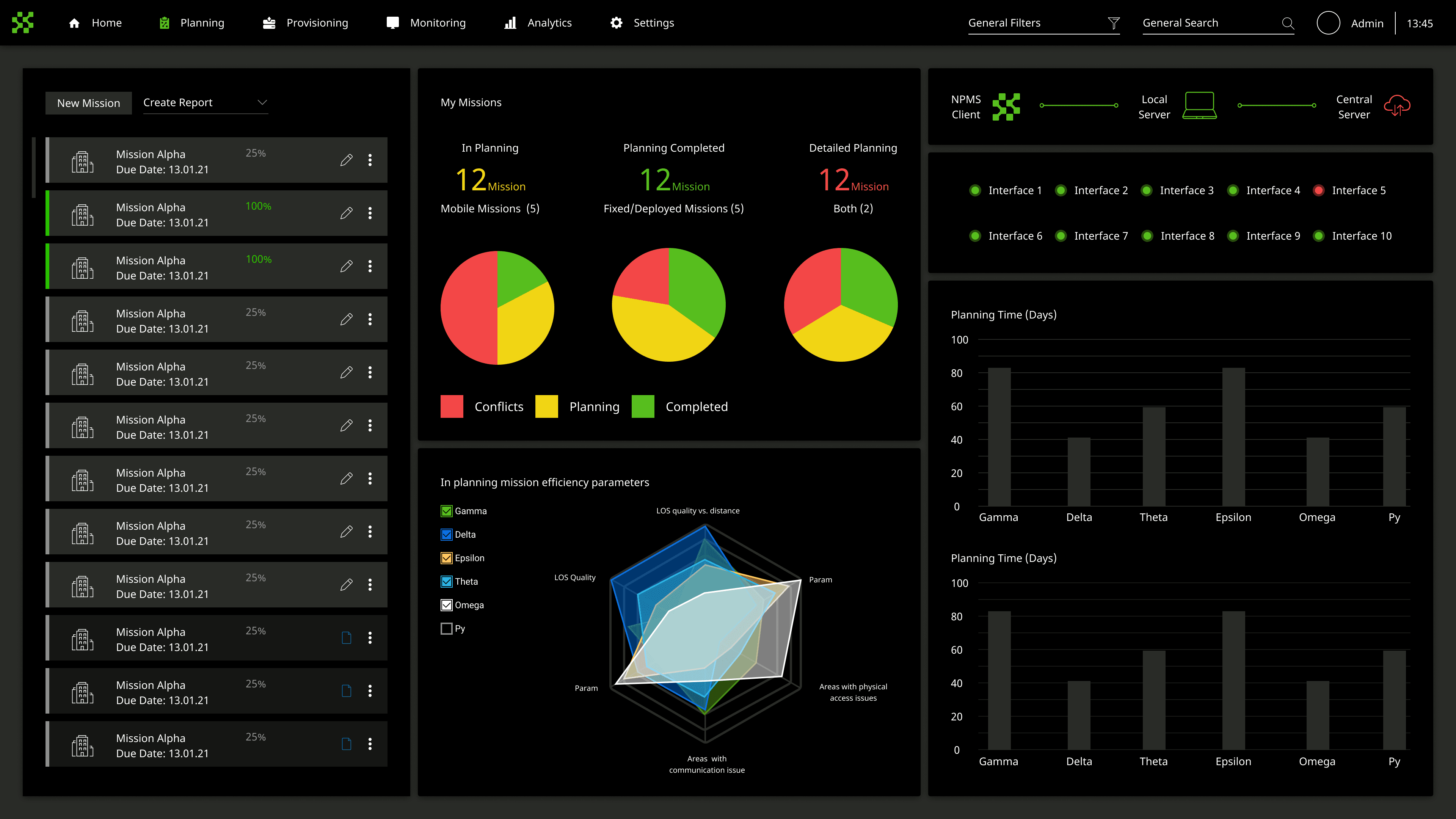
The full NPMS planning system: a dashboard tracking missions across planning stages, a map-based workspace for building communication plans from battalion to platoon level, an analytics view showing resource coverage and utilization across the plan, and a multi-alternative comparison mode for side-by-side review. Component infrastructure built for this system was reused on subsequent Elbit programs.
What it changed.
The usability workshop was the proof of concept. Two days of scheduled testing compressed to two hours because participants worked through the full planning flow with almost no guidance. The design had found the right abstraction - not a GIS tool, not a spreadsheet, but a planning workspace that matched the mental model a signal officer already brought to the table. The components were reused on later Elbit programs. Elbit won the contract.
COGAT Aid Portal
Redesigning humanitarian data transparency under diplomatic pressure.