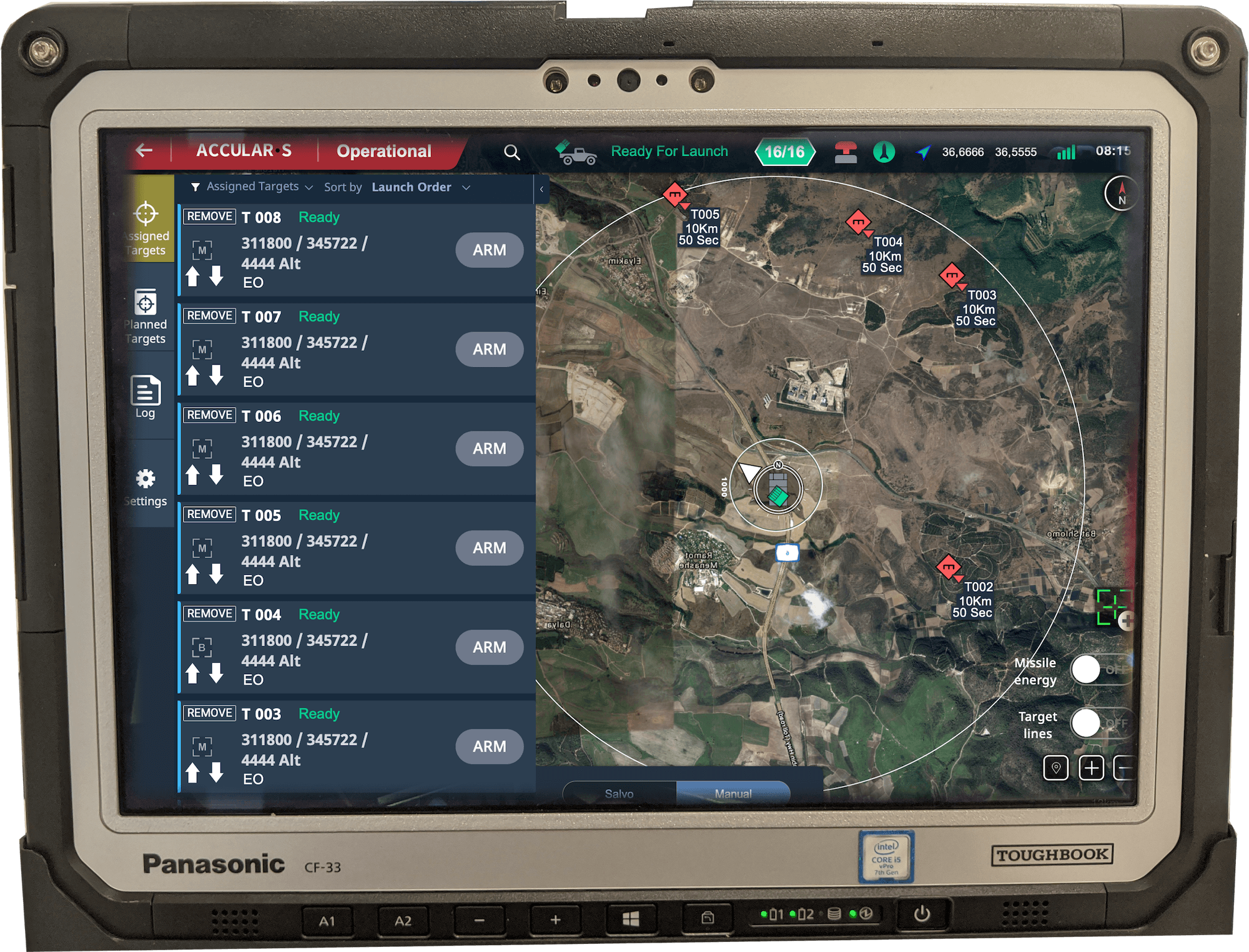
“The launcher is a missile pod on a rotating pedestal, mounted on an APC. The operator is up to ten kilometers away, holding a ruggedized tablet. Between them, the system had to make picking targets, queuing them, and authorizing a multi-strike feel like one continuous gesture, three clicks from receiving a target to missile impact, in under twelve seconds.”
Kidon is a remote-controlled missile launcher. The hardware is a multi-missile pod on a rotating pedestal, typically mounted on an APC or another armored vehicle. The operator works on a ruggedized military tablet, up to ten kilometers from the launcher itself. They pick targets from a map (either pinning new locations from field reports or approving target injections from forward observers), select how many missiles to fire and at which targets, then authorize. The pedestal rotates toward target one, fires, rotates toward target two, fires, and so on, with no further input. As Project Manager and UX Lead I owned the design end to end and synchronized four disciplines: UX, UI, industrial design, and Unity programming.
How the system came together.
Rapid design thinking workshop
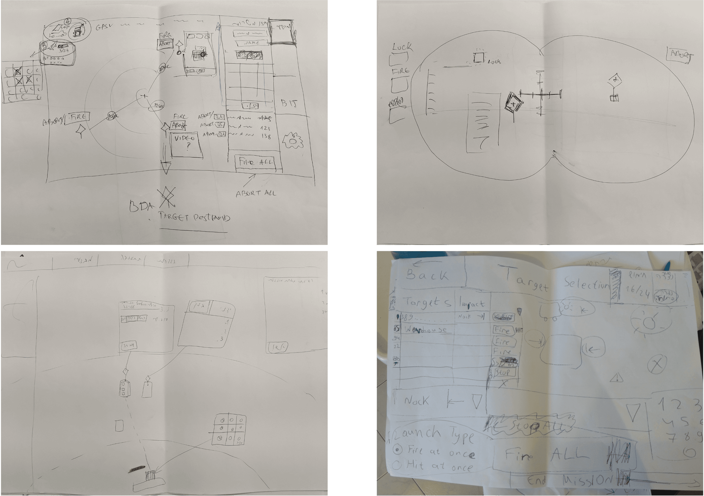
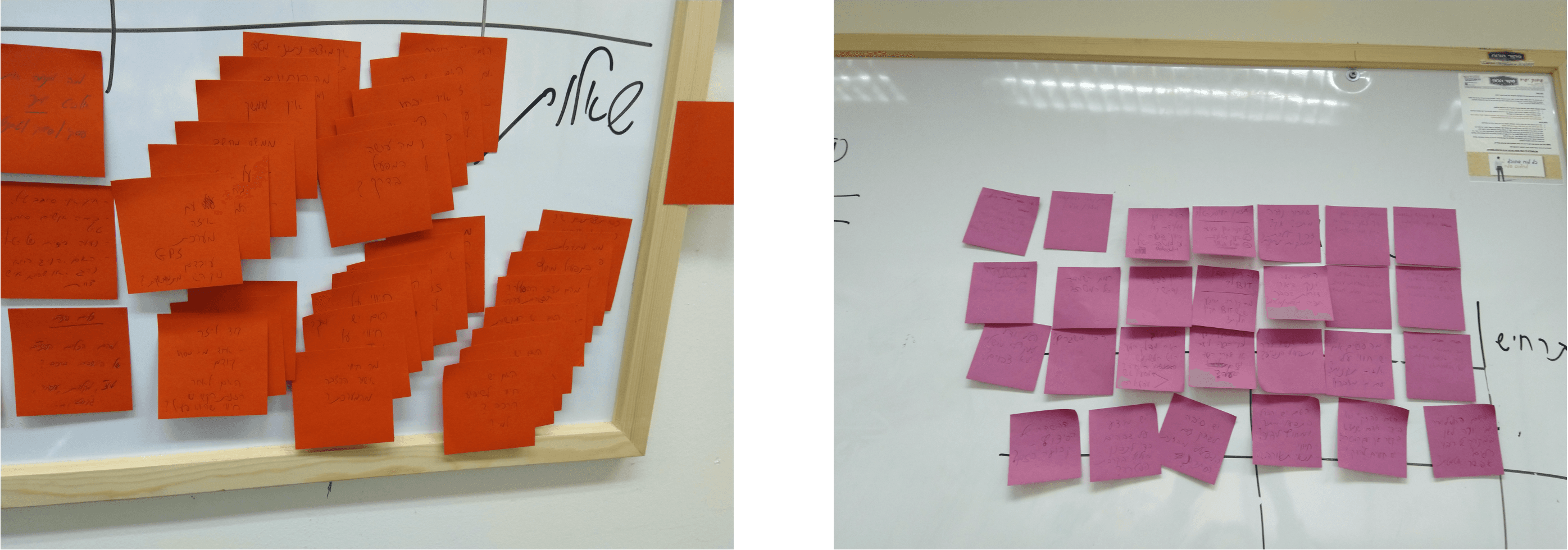
The project started with a one-day workshop. Every working department was in the room: UX, industrial design, programming. An operational SME led the session, laid out the system requirements, and answered the questions only an operator could answer. The workshop ended with several working concepts, captured on paper, ready for elaboration.
Information architecture
With the chosen direction, I mapped the full information architecture of the system: every screen, every state, every transition between target acquisition and launch authorization. The IA had to absorb edge cases the operators raised on the fly, without breaking the promise that the operator (sitting kilometers away from the actual launcher) could trust the system to do the right thing.
From UX into UI
One concept was selected after consultation with the client and SME, then elaborated into full user flows. From there I worked alongside the UI designer to layer visual design over the UX. The interface is desktop-class but runs on a ruggedized military tablet, so every touch target had to account for gloved hands, direct sunlight, and night operations on the same screen.
The first UI pass failed the sunlight test immediately - contrast ratios that read well in a dark room were unreadable at noon on an APC. We rebuilt the contrast system with direct sunlight as the baseline and let the night case inherit from it, which left the night interface harsher than it needed to be. The other half of the answer was not in the interface at all: the tablet carries its own hardware brightness configuration, and it has to be set correctly at initial power-up or the screen loses the argument before the software is ever opened. Designing for this system meant specifying what happens before anyone launches it.
From the office to the field
Early in the project the team had specced bespoke military hardware to handle the launcher's positioning and orientation - expensive, slow to mount, slow to calibrate. As Project Manager I synchronized UX, UI, industrial design, and Unity programming, and weekly reviews kept the four tracks moving in step. The deeper change the project produced was cultural: people stopped designing from the office and started designing from the field.
I ran the workshops as an open dialogue with the operational SME rather than a requirements readout, which is a slower format and the reason this surfaced at all. Mid-session he mentioned, in passing, that every soldier already carries a phone with a compass and GPS. He was describing his day, not proposing a solution - the design job was hearing that a settled hardware decision had just been made redundant, and being willing to reopen it after the component was already specced and budgeted. One session replaced an entire bespoke hardware line.
What we shipped.
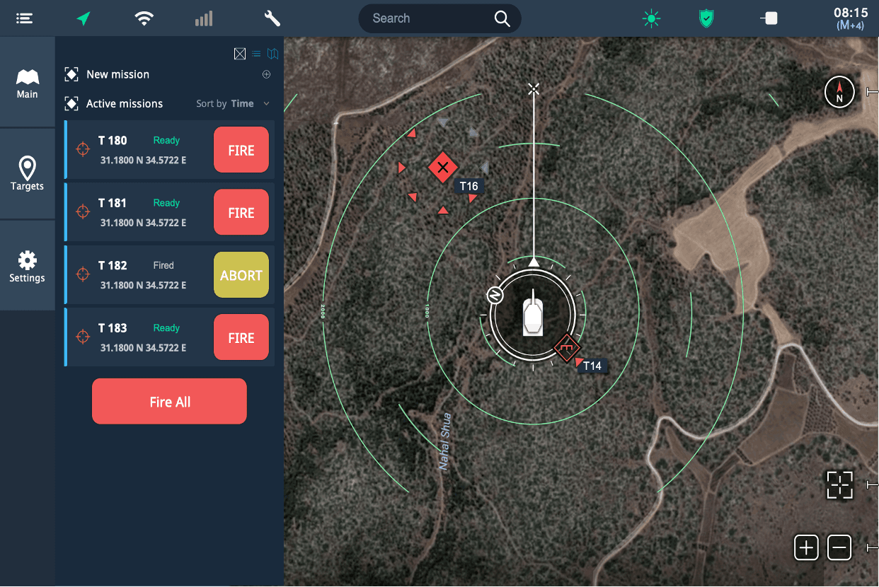
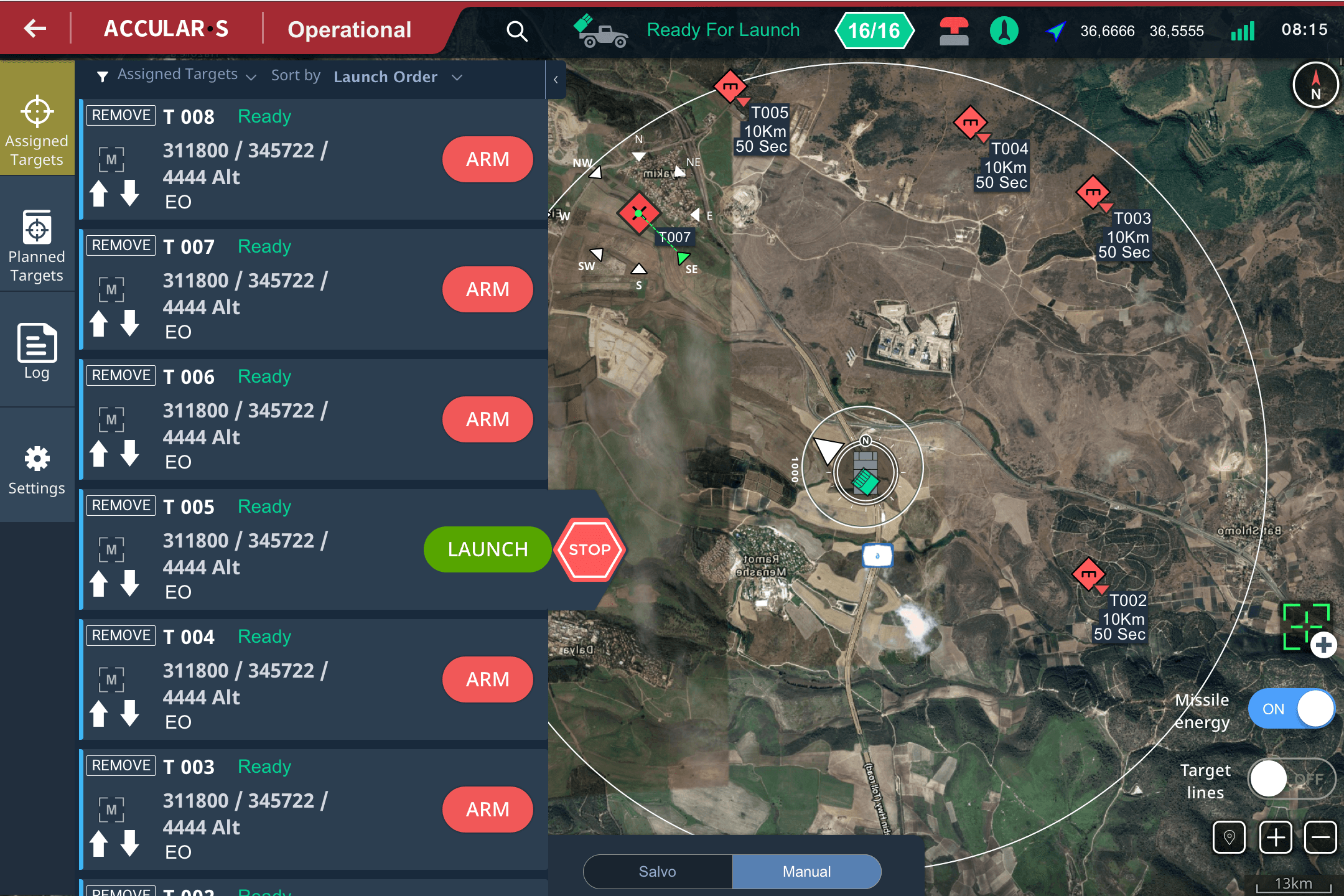
The final interface: a map-based workspace on a ruggedized military tablet. The left panel holds the target list and queue. The map shows the launcher's current orientation and the strike path. A single authorization step hands control to the pedestal - it rotates, fires, rotates, fires, with no further input. Touch targets sized for gloved hands. Contrast ratios tested for direct sunlight at noon and complete darkness on the same screen. The three-click sequence from target acquisition to launch is embedded in the interaction model, not bolted on.
What it changed.
Three clicks. Under twelve seconds. The product managers called it the game changer, and they were right. The speed itself was the headline, but the deeper unlock was cultural: using a phone's compass and GPS instead of bespoke military components was not a clever shortcut, it was proof that the team had stopped designing from the office and started designing from the field. Once that switch flipped, every other decision got simpler.
Cytotech
Cyber Offense Made Operable